Wednesday, 10 February 2016

Planning: Things I want to improve on my final draft

Through the creation of my final draft I've come across things that I want to change for my final creation of my magazine.

1. Fonts
I struggled to find fonts that I want to include in my magazine, I found that most of the fonts on the current pc I'm using isn't conforming with my needs for the style of my magazine. The fonts I have used are to bulky and to conform with my genre. I need to research more into my fonts and get them downloaded.

2. Contents Page
I am still struggling with my contents page and the layout of it. This is what I would want to change the most about my magazine. I have found this the most difficult part of my magazine because it wasn't easy to associatate it with the geometric theme of my magazine.

3. Cover lines 
I am not overally happy with the position I have placed the cover lines. I believe they cover up too much of the front cover which is not what I wanted to achieve as a lot of magazines around this genre have their cover star as primarily the main focus.

Tuesday, 9 February 2016

Drafting and Planning: Contents page theme


Through much consideration into what I want the theme for my magazine to be  I have chosen a geometric theme. This came about through my research into magazines into my chosen genre which is indie/alternative. I came across a geometric pattern on the contents page and double page spread. This made me think if I could potentially do this for my magazine. I then decided to see which artists have been used in this type of theme. The magazine above shows the band imagine dragons in the triangle above. This is a band that is associated with the alternative genre therefore convincing me to use the geometric design for my magazine. Another thing is the editing in the photos, through conducting more research into the photography in geometric frames I noticed light strobes were used for effect which is what I will be trying to get across in my magazine. 


Monday, 8 February 2016

Planning: CoverLines


I wanted to analyse this magazine today to figure out what type of conventions are apart of my genre of magazine. As we see we have no skyline or pug however I believe my magazine would benefit from having these conventions as apart of it due to the blank spaces needing to be filled in. I want the fonts to be inspired by this magazine in particular as I belive they capture the essence of the free flowing summery vibe that my magazine will need to portray to focus on the genre. The cover star is giving direct address however a part of me doesnt want the audience to be looked at to also keep the theme of the grungy indie vibe. My magazine is a contrast between the alternative and indie rock genres as I belive it gave a larger working plain.

Thursday, 4 February 2016

Researching into Similar Products: Figuring out Double Page Spread


I have chose these 2 magazines as I have chose a specific design for the double page spread. The first magazine is what I admire for photography this is because it is different to what I have seen in previous music magazines. Having the artist on the side almost creates a presence as it wouldn't be like this normally, in my photography you will see a photo similar to this however it is fully facing the left hand side, this I believe would be good for my double page spread as i could put the writing around the artists head. I also was struggling where to put my artists name. The second photo allows the artists name to be showcased with being apart of the background creating a flow within the photo. 

Wednesday, 3 February 2016

Drafting: Second Edit of Photos


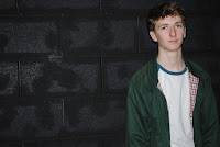
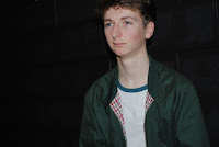
From my second photoshoot I have chose these 5 photos out them. The reason I have chose these photos is because I believe they offer a range of indie poses and conform to the indie genre. The photography was taken in a drama studio with black walls. I utilised these black walls to use an effect to make it completley dark therefore creating the effect of the artists being the only thing that are neccesary to look at. The effect of P5 is quite dark and mysterious however possesses a tint of blue which is passed on to the participant of the photo. This makes the artist on this occasion seem very cold which definatley showcases their genre of music which is indie as it associated with the cold and not caring vibe.


Tuesday, 2 February 2016

Organisation: Second Photography Session


 Here is my photos from the second photography session. This took place in a drama studio, this was really useful for me as it allowed me to use the black walls and take advantage of the dark environment. I also used our teachers camera which was of semi-professional standard. I took the time to take pictures of my secondary artists which are shown on the top few pictures. I kept in mind where I wanted to put these secondary artists, this will be on my contents page primarily as the coverstar will take over the front cover and doible page spread.