Layout
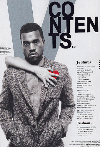
The layout for this magazine is also very simplistic, much like the NME magazine contents page. This is clearly a very popular strategy as it engages the audience very effectively. The contents page is very chronologically organised, for example the features of the magazine are clearly indicated on the right hand side and are neatly presented. This shows to the readers the company of this magazine has took time in the creation of this magazine showing that they are a well presented company and deserve recognition. I like the use of the "V" for the promotion of the brand Vibe. This is used to give easy recognition without using a lot the space, allowing a spacious canvas for the readers so their not feeling overwhelmed.
Colour
The colour in this contents page is black and white, however we see a pop of colour with the red heart with a womens hand grabbing it, this could be an indication of what the article is about. The red contrasts with the black and white theme making this section of the article eye-catching therefore making the readers not pass over it and actually take time to read it.
Photography
The photography in this contents page is very much like a front cover, the model is in the middle given priority is making eye contact. This is giving the readers direct address allowing them to feel involved. The photography is also pointing out a story with Kayne west possibly his heart being ripped out by a women.
No comments:
Post a Comment