Thursday, 28 January 2016

Organisation: Coverlines

The coverlines for my magazine will envolve these following things.
-An upcoming gig list in the surrounding area
-News on similar artist such as new bands and what albums are being released
-Top tips to get into clubs underage
-How to become the next artist
-Competions such as like our Facebook page and follow us on Twitter for a chance to win a meet and greet with Mumford and sons or a holiday to go see peace perform in Ireland.

Tuesday, 26 January 2016

Organisation: Feedback on first draft

I have received feedback from my peers on my first draft. This draft wasn't the best in my opinion however my peers believe some aspects were good and that should keep them.

Front cover:

Through my feedback I realised that people really like the use of the erosion on the masthead as it create an edgy feel. They also like the use of the coverlines as they believe the content they possess fits in really well with the magazine genre itself. However the photography could be better in the sense of the resolution

Contents Page:

The contents page received the worst feedback as the layout wasn't good at all, the contents page also seemed very bare and didn't have much do it. This I can work on as the photography session is tomorrow.

Double Page: This received barely any criticism as the photography fit in with the theme of the magazine, the only feedback that I received was that the text wasn't visable and that I could potentially need a new photo to showcase my text a lot more.

Monday, 25 January 2016

Drafting and Planning- Some Article questions.

I have to conduct a interview with my chosen coverartist to entice the readers into reading more about their favourite indie artist. These questions will be placed on my double page spread.

My first question that will be present on my article is, What type of message will your new album entail?
The answer: The message of my album will be about believing In yourself and believing in your abilities to achieve the best in life as I believe it represents my story and shows where ive come from as an arist.
The second question that will be asked is: Do you believe in your abilities to have your album go to number 1?
The answer: Yes of course I do I believe that my album can get to a good rep in the music industry.
The Last question I thought of was: What was your inspiration for creating this album?
The answer: The inspiration for writing this album was through a trip down memory lane and going back to my parents house and it all coming back where I started out. I walked past a corner shop where I used to right music based on the view I could see. It was a view of my city and It was an emotional journey. So I then believed I should write an album based on my area where I grew up.

Thursday, 21 January 2016

Organisation: Second Photo Shoot With Fashion Choice.

Tomorrow I will be conducting a second photoshoot. This photoshot will be taken place in a drama studio which will enable me to use lighting, I believe I can use the lighting to my advantage and have a neautral white lighting. The drama studio has black walls which will allow me to do alot more with it, and have the artist be the centre of attention with them wearing a green harrington jacket to highlight their authority. I will have my artist stand in various positions in the frame to give me a larger variety when coming to create my magazine as i found that my last photoshoot didn't offer alot of choice when it came to actually creating my first draft. Therefore i will make sure to take many photos.

Wednesday, 20 January 2016

Planning: Names of my Solo Artist

Dean Elliott
Jay Foss
Dwain O'Neill
Dale Ellis
Keiran Close


Here are some names that I have come across that I believe would be great for my artist to have. I believe my decision is set with the first one Dean Elliott. The reasoning behind this is that I believe it has a nice ring to it, however I really like the way that a similar artist to the genre James Bay has a short name which i believe is cathcy and works nicely. Therefore I believe Jay Foss would be better so it is definatly between these two.

Monday, 18 January 2016

Drafting and planning: Layout of magazine ideas.

With my magazine I want it to look more than just the average indie magazine out there. I want to bring my love of mixed genre into my magazine. I thought these designs captured various genre techniques for example the bottom magazine uses geometric designing on the left hand side to convieniently position a section of text that is easily accessible by the reader. I really like the one in the top right corner, this is because of the positioning of the text I believe this would be perfect for my magazine as it would still leave room for text however would also leave room for the cover artist themselves. I really like the photography as well as the layout, I believe incorporating the action shot of the coverstar really gives it an iconic look.

Friday, 15 January 2016

Drafting and Planning: Double Page Spread Layout


This picture is what I want to portray through my double page spread, I really like the contrast between the grey and white and like how the name of the artist carry's forward. I believe this gives a sophisticated look however still possess an element of grunge. I believe I can make the text very unique and sit right around my chosen cover-star. This will also give me an idea of certain poses I may want to have my star be in during the photography.

Thursday, 14 January 2016

Drafting : First Draft of Full Magazine


Here is the first draft of my magazine to give you an overview of what I am aspiring to. I will go through each of them explaining what I tried to achieve and how I want my actual magazine to look like.

Front Cover:

I really like the photography of this cover as I believe I edited the photo very well to achieve the right amount of lighting and to create the contrast of the colours. Here I tried to incorporate many of the magazine conventions as I could for example the pug in the top right hand corner, looking back at this I should of made it a bit more vibrant and make sure it isnt as big due to it taking away from the masthead. I really like the coverlines as I believe they are placed just right. Due to me using publisher I wasnt able to achieve the magazine I wanted however for my real magazine I will be using PagePlus which will allow me to do alot more with the magazine itself.

Contents:

With the contents page I really struggled with what I wanted to look like which highlighted to me instantly that more planning should be done here. However I gave it my best shot at trying to achieve what I wanted my magazine to look like, I believe I have failed here to capture the realism of a magazine and will not be using this in my actual magazine. Although I dont like the magazine contents page, I do infact like what is advertised there, such as the behind the scenes of the TUT! photoshoot. I believe this is very unique and would appeal to many people in the indie genre.

Double Page Spread:

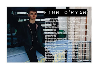
Again I really like the photography used here and I especially like the way the artist is looking over near the text on the left hand side. The article hasnt been placed in there as I have not quite yet thought of the questions that will be asked or the answers that will be given. I may conduct an interview with Finn and get his answers to create the full effect.

Wednesday, 13 January 2016

Drafting- Edit of photos


These three photos are in my opinion the best three photos from the photoshoot, however they were very over exposed to fit my chosen genre of indie rock. With the first photo I chose an effect that emphasised the shadows alot more, this was A6 on the app VSCO cam. I thought this was a good idea as it would also emphasise the lighting which as we can see has showcased his face giving him a sense of authority.

With the second photo I only needed to add an effect the photo wasnt overly exposed at all however did need slight tweaking. The effect is A6 again with a higher contrast to create this effect of washed out colours.

The third photo I have edited to showcase my band that I'm using, We see the photo focuses on the whites and dark colours making it very deep and mysterious. I like the way it does this as the main singer of the band (One on the left) isn't shown giving a sense of insecurity about the new and up coming band.

Tuesday, 12 January 2016

Drafting and Planning - Photos

Here are the photos that I have aquired from the photoshoot, I believe the photos turned out well and are possible contenders for my actual magazine, However some photos may need editing, this is just for the exposure and some little details that I do not want to be apart of my picture.

Monday, 11 January 2016

Organisation - Front Cover

In this post I'm going to be explaining what I want to include on my front cover as I believe to make a realistic looking magazine you first need to plan out what should be apart of it. This is my checklist:

PUGS/PUFFS

MASTHEAD

COVERLINE

ICONIC LOGO

BARCODE

SKYLINE

DATELINE

One big issue that I find some magazines have is that they don't make their main coverstar stand out as much as they should do, I especially find that fashion magazines and general gossip magazines are bad at completing this particular task.

Thursday, 7 January 2016

Planning - Weather for my Photo Shoot

I wanted to begin my photoshoot with a particular weather arrangement, I decided I wanted a overcast setting as it would conform with my chosen genre type. I decided me an my chosen model should go and find a old school area which had been revamped to modern. My immdiate thought was the Custard Factory. Here we took a variety of photos that I believed turned out well. Due to darkness falling earlier in Janury I wanted the light to be still around, I thought the best time of the day was midday as the sun would be fully risen given me the amount of exposure I wanted.

Wednesday, 6 January 2016

Planning: Fonts

Here are the fonts that I would like to consider for my magazine, many of these are very individual which I believe would showcase the genre of Indie Music. Some I especially like is the the bottom one due to the eroded effect. I also like the one in the middle right as it is very unique and would stand out more.

Tuesday, 5 January 2016

Drafting and Planning: Generated Names for Band

These are the names that I have generated based of key words, for example vinyl. These names for the most part conform with the genre of my magazine. Some of my favourtie names are:
-Censored Vinyl
-Skinny Barbie
-Inside Acid
-Solving Angst
Each of these conform with the Indie genre due to them being very ambigious. In particular Censored vinyl, this is because the indie genre is very taboo and pushes the boundries, for example the iconic Nirvana album "Nevermind". Vinyl's are also linked in with the genre due to many vinyl's being linked with bands and 80's which was the period where indie rock really took ahold on a larger scale.


Monday, 4 January 2016

Planning- Outfits for my Model

This would be the outfit that I would like my artist to have. I believe the dark colours will allow to use the background alot more to my advantage for example using a solid wall to make the artist stand out alot more. I believe this captures the overall ethos of the magazine as it incorporates many clothing items that are associated with the indie genre for example the Doc Martens and the Black Skinny Jeans.


Sunday, 3 January 2016

Planning- Facial Expressions for model


Here are portraits of various facial expressions that I believe I could incorporate into my magazine within my photography. The far right one I believe the straight face connotates with the ethos of indie genre which is has a very low mood.


Saturday, 2 January 2016

Organisation: Background of CoverStar

My chosen coverstar is in their early 20's, this means they have had the experience of being a teen and clearly remember all the rebellious things they have done. This transfers into their music and they write alot about their past experiences. I have conveyed their dark experiences in my first draft of my magazine as all the pictures show him looking into space.

He also stands up for what he believes in and is quite peaceful. He has featured in many bands songs such as Peace, Jaws, ACDC and Kodaline. This will be feautured in my magazine.

He grew up in a very torn down area in the back streets of London. Which I have also conveyed in my photography especially in the picture which is being used as the double page spread.
(With him sat on the blue wood, almost broken, worktop.)

Friday, 1 January 2016

Research Into Similar Products: Backgrounds


We see in this magazine here that the background is a black and white panneling, I sort of took inspration with this in my photography however I believed it would be more fitting to have the artist be more abstract and be apart of the background to not follow the codes and conventions as if to be rebellious against them.


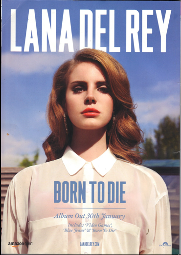
 This image is of Lana Del Rey another celebrity in the indie genre of music, here we see her background is very different to the other however is equally as effective, I like how the photographer has used the sky as it connotates to freedom. Indie genre is all about being yourself and being individual. Therefore I believe this strongly puts forward a clear message which I should do for my own magazine.