Thursday, 14 January 2016
Drafting : First Draft of Full Magazine
Here is the first draft of my magazine to give you an overview of what I am aspiring to. I will go through each of them explaining what I tried to achieve and how I want my actual magazine to look like.
Front Cover:
I really like the photography of this cover as I believe I edited the photo very well to achieve the right amount of lighting and to create the contrast of the colours. Here I tried to incorporate many of the magazine conventions as I could for example the pug in the top right hand corner, looking back at this I should of made it a bit more vibrant and make sure it isnt as big due to it taking away from the masthead. I really like the coverlines as I believe they are placed just right. Due to me using publisher I wasnt able to achieve the magazine I wanted however for my real magazine I will be using PagePlus which will allow me to do alot more with the magazine itself.
Contents:
With the contents page I really struggled with what I wanted to look like which highlighted to me instantly that more planning should be done here. However I gave it my best shot at trying to achieve what I wanted my magazine to look like, I believe I have failed here to capture the realism of a magazine and will not be using this in my actual magazine. Although I dont like the magazine contents page, I do infact like what is advertised there, such as the behind the scenes of the TUT! photoshoot. I believe this is very unique and would appeal to many people in the indie genre.
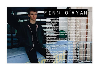
Double Page Spread:
Again I really like the photography used here and I especially like the way the artist is looking over near the text on the left hand side. The article hasnt been placed in there as I have not quite yet thought of the questions that will be asked or the answers that will be given. I may conduct an interview with Finn and get his answers to create the full effect.
Subscribe to:
Post Comments (Atom)


No comments:
Post a Comment